

AARP Eye Center


Q&A: 'Mad Men' Illustrator Brian Sanders
By Patrick Kiger, March 19, 2013 03:08 PM
One of the things that keeps so many of us avidly watching Mad Men, AMC's epic series about the audacious misadventures of advertising industry reprobates in the 1950s and 1960s, is the show's stylish period panache, from the classic contour of the bespoke suits and skinny neckties worn by rakish protagonist Don Draper to the mid-century modern decor of Don and trophy wife Megan's apartment (which, as this Los Angeles Times article details, was meticulously assembled by designers who scoured eBay to find an actual 1964 white metal patio dinette set).
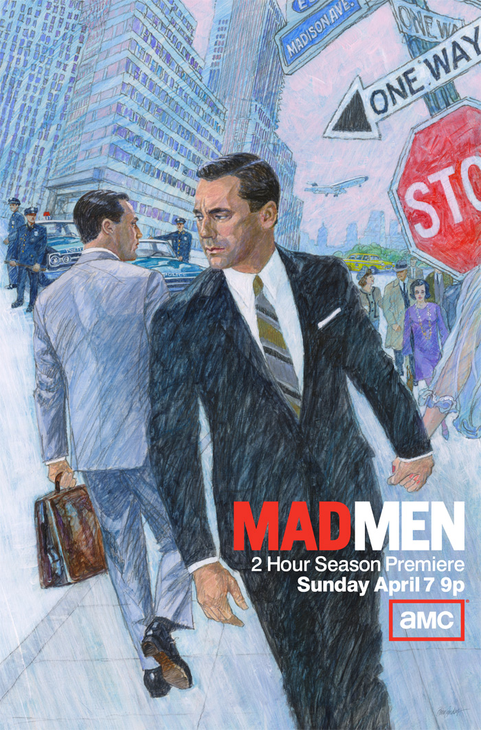
So it's all the more fitting that Mad Men producer Matthew Weiner decided to promote the series' new season in April with a poster drawn by Brian Sanders, one of the great illustrators of that period. (From BBC News, here's a video of the 75-year-old illustrator at work in his studio in England.)
In an e-mail interview with AARP, Sanders was kind enough to take a few moments away from what he calls his "daily fix of pencil" to talk about the poster and his career.
Q: From the online gallery of your work, it's clear that your work has evolved tremendously since the 1960s. A recent story about you in the Guardian, a British paper, explained that you went back to a period technique of painting with acrylics - a friend of yours calls it "bubble and streak" - that you haven't used in many years. How difficult was that?
I did a few trial pieces and was surprised that it did not take too long. Having quite recently been asked by a young illustrator, via email, how to accomplish the technique, in answering him and writing it down I only had to follow the advice. Also my style of drawing beneath the paint surface has not changed a great deal over the years.
Q: You've said that you're a fan of Mad Men because it reminds you of London in the 1960s. The series actually had a British character for a while, and a lot of references to British pop culture and events of that time that been woven into the show's storyline - everything from Don Draper being backstage at a Rolling Stones concert to Sterling Cooper's competing for the Jaguar account. Is it interesting to see your own past through a different lens?
Yes, and it is and pleasant sometimes to see British actors being used in a wider context in the U.S.A. and not just to portray villains.
Q: You've had a long, diverse and phenomenally successful career, from book covers and magazine spreads to working for Stanley Kubrick during the production of 2001: A Space Odyssey, and you're still creating new work. Could you talk about how you've managed to continually reinvent yourself over the decades? What inspires you?
Inspiration is not a word that I use a great deal. My driving force is the need to do the work. I'm currently trying to complete the second of a trilogy of illustrated books relating to my early life. They are intended to appeal to people of all ages. In the first, entitled: Evacuee: a Wartime Childhood, I say that I have always wanted to be an artist and am still trying. Perhaps that sounds a little facetious, but it is basically true. I have never consciously tried to reinvent myself, rather like Mr. Micawber who was also, like me, a onetime Royal Marine, I tend to think things will turn up and often they do.
Q: One of your more exotic assignments was creating postage stamps for the Marshall Islands. How did that come about?
After having designed a number of British stamps, the Unicover Corporation in the U.S.A. commissioned for the Marshall Islands' history of World War II in postage stamps. This in turn led to designing further sets and coins, all of which covered a decade of time and took me out of circulation here in Britain.
Q: You've branched out into working in three dimensions as well. Could you tell us about that?
Following this, I and my wife, the artist Lizzie Sanders, who's currently reading for a Master's degree in modern history, were offered out of the blue the opportunity to work together on a project to design a pop-up doll house. This in turn led to more 3D work, some of which we initiated ourselves, such as a build-your-own paper scale model of Stonehenge, and and so on.
Q: Getting back to your Mad Men poster, it seems to have some symbolic content - for example, the man who's passing Don Draper bears a certain resemblance to him from behind, and there are police officers on the street in the background. Are these just things that you imagined, or does the poster contain some hidden clues about this season's storyline?
These are the questions most asked and I am not in a position to answer to them, so for the present the enigma remains.