AARP Hearing Center
5 Best AARP Research Infographics of 2013
By Becky Gillan, January 2, 2014 12:41 PM
The end of the year & beginning of a new year is the time when everyone makes their "lists," so here's mine. 2013 was the year of the infographics for AARP Research. Infographics allow us to succinctly communicate important facts as well as tell an overall data story in a visual manner. We learned, like many others, that visual images get more attention than text as the brain can process the visual faster.
Of the 48 infographics AARP Research has posted on the aarp.org website, here are my five favorite, with a factual highlight from each. Click through any of the thumbnails to see the infographics in full size.
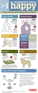
1. The Things That Make Us Happy
At what age are people the least happy? 50! Stress from children living at home, work, and older parents make it a difficult age.
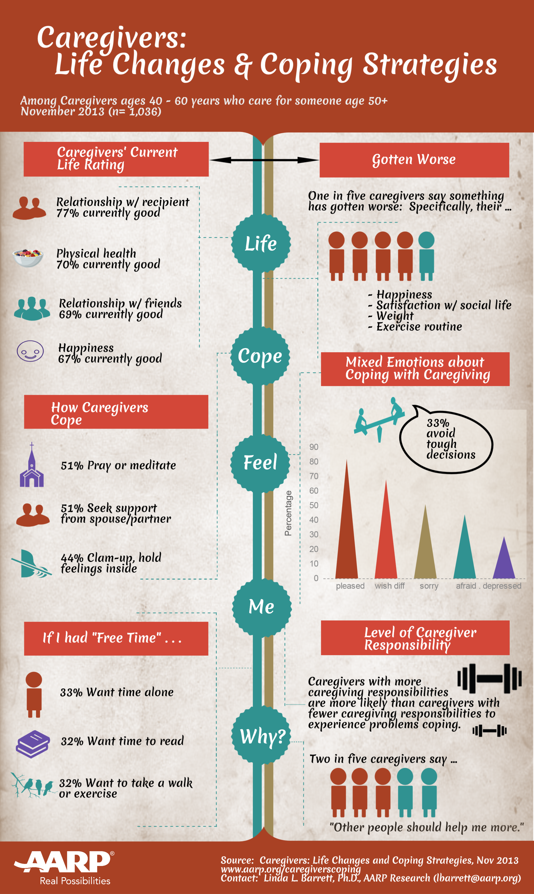
2. Caregivers: Life Changes & Coping Strategies
44% of caregivers say they cope by clamming up inside.

60% of older workers say they work because they need the money.
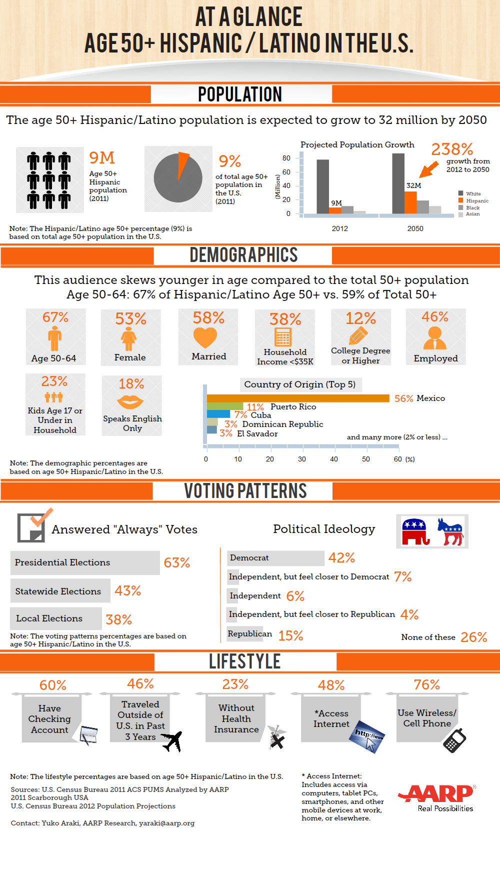
The Hispanic 50+ population is expected to grow 238% by 2050 to 32 million.
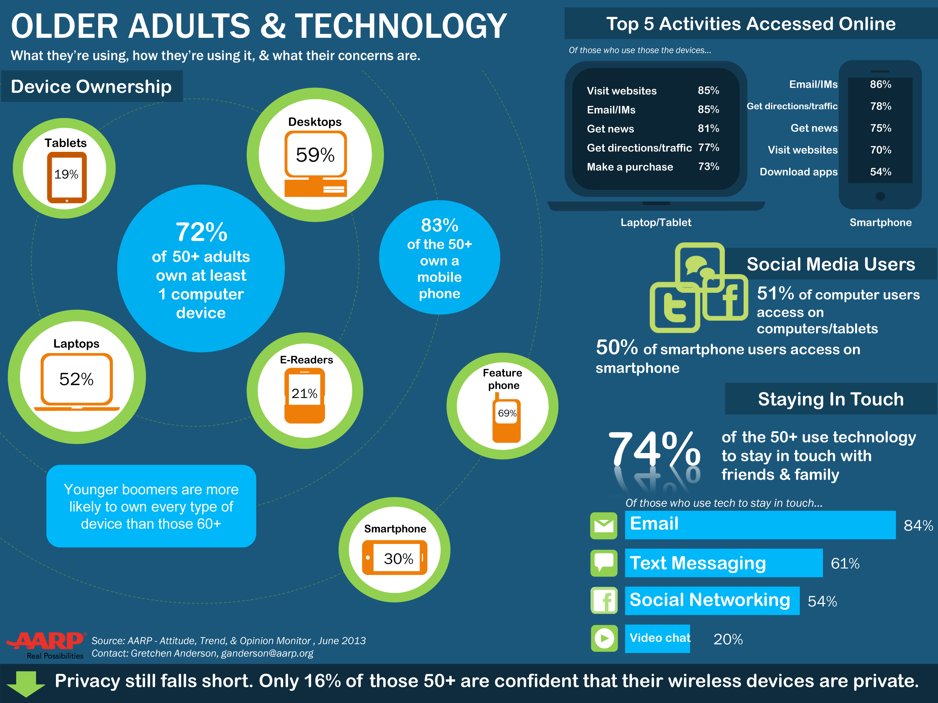
Among 50+ adults who use laptops and tablets, 73% have made a purchase online.
If you're interested in creating infographics of your own, here are some tips we've learned through our own trial and error this past year:
- Figure out what's important to your target audience.
- Stay focused; you probably cannot cover all you know about the topic.
- Even with focus you still will want to delete information unless it is critical to your insights. Most people spend a maximum of 3 minutes reading an infographic.
- Organize the story: Start with your most powerful insight, use the middle to provide supporting information and end with a compelling conclusion or call to action.
- Think about the visuals: while the topic should inspire you, use multiple colors (but not a rainbow), use curved lines (not all straight), and remember to fill the page without cluttering.
In 2014, we're looking to create even more (and better!) infographics. We may even branch into some interactive visuals...
Stay tuned and Happy New Year!
Becky Gillan is senior vice president of AARP Research and is focused on fostering understanding of the interests and concerns of people age 50-plus and their families. Before coming to AARP, Becky served as vice president of Global Market Research & Guest Satisfaction for Starwood Hotels & Resorts. In her spare time, she likes visiting her niece in Ohio, gardening and collecting American art and antiques.


